SimplyHome
A responsive website design
Role: UX Research, Brand Design, Product Design
Timeline: 3 months
Tools: Figma, Miro, Optimal Sort
Empathize
Competitive analysis
User Interviews
Define
Affinity mapping
POVs & HMWs
Personas
Design Process
Ideate
Storyboarding
Card sorting
Site mapping
User Flows & Task Flows
Prototype
Low / Medium / High fidelity wireframing
Test
Usability testing
Revisions
The Problem
People that are planning to move will end up settling on their new location for a variety of reasons, but to find their new location can be tricky and time consuming given the overabundance of information and resources they use to find it.
Oftentimes, people waste a lot of time searching for homes and are relying on multiple different resources for specific bits of information that’s relevant for their move. In addition, people are sometimes unsure of what it’s actually like to live in an area before they move, causing undue stress and anxiety
The Solution
A one-stop-solution for finding your home that provides you with all of the relevant information you need to feel confident about your move - SimplyHome
Empathize
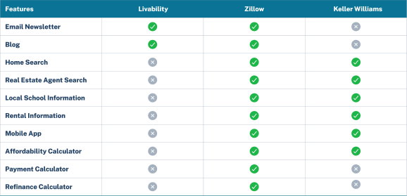
To better understand the users, I researched what other resources that I suspected people use when finding information on where to move. Through competitive analysis, I was able to identify strengths, weaknesses, and potential opportunities for a better design.
Next, I conducted user interviews to help me understand their journey and identify any shared issues or opportunities that may exist. After creating an interview discussion guide (hyperlinked), over the course of 5 interviews conducted via Zoom, I found that:
Each individual moved to either be closer to family, needed more space, moved for their career, or a combination of these three.
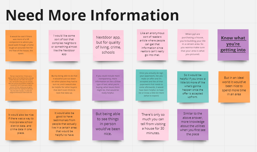
There was a high need for clearer, more transparent information in one central solution
Multiple resources are used for information gathering
As a result, a lot of time is spent in the search process moving from resource to resource
While multiple resources are used initially, each individual would ultimately find their home with the help of a realtor
Define
By taking the results of the user interviews, I created affinity maps to uncover patterns that would identify areas to further explore.
Working off the affinity maps, I created POV statements and HMW questions to assist with narrowing down the problem I’m trying to solve, and guide the creation of my user personas.
“I’d like to explore ways to help users that are moving find information on the area they’re moving to more conveniently because they spend a lot of time researching that information and consolidating it would make their decision easier.”
“How might we provide users moving to a new area with information that is relevant to them?”
To better understand the user’s motivations and pain points, I created personas. These would also serve as a guide during the ideation phase.
Ideate
I then focused on creating a list of user-centric content requirements by conducting a card sort with 5 participants sorting 34 cards. This helped me understand how users naturally categorize information, and would guide how I created the site map.
I started ideating on these findings by sketching a couple of storyboards depicting real-world problems uncovered in the user interviews, and applying use cases for how they might be solved.
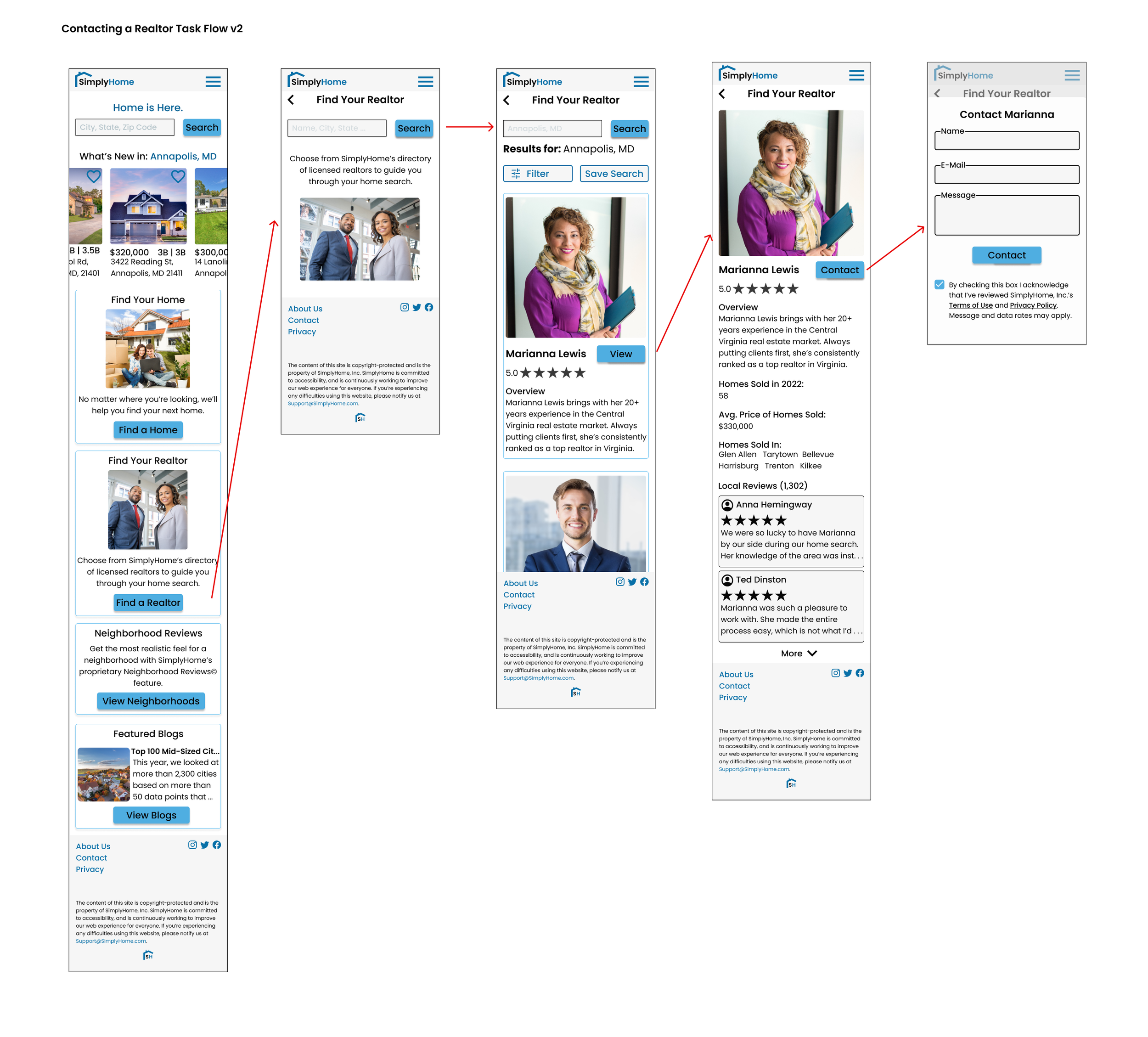
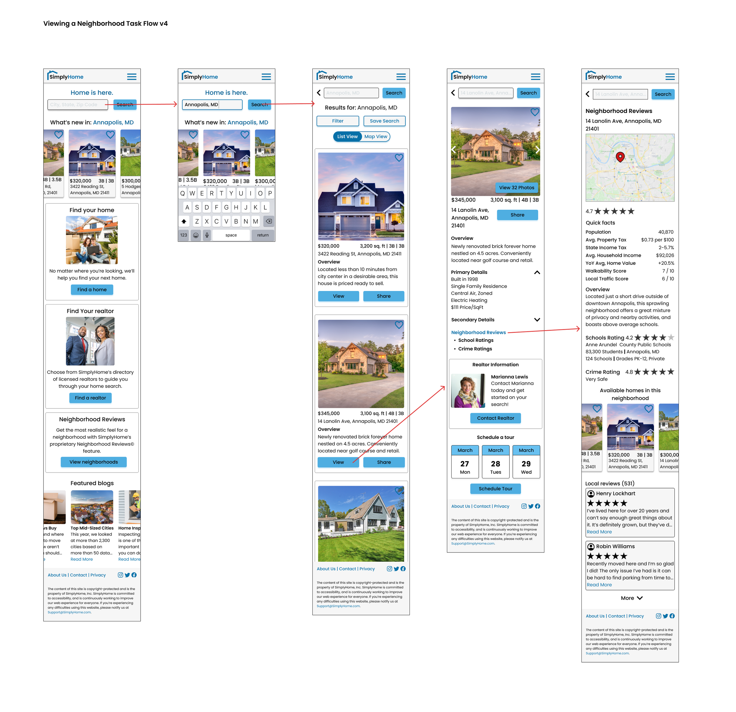
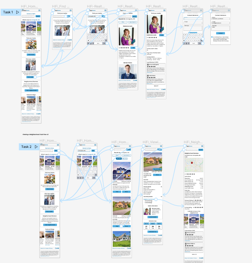
After mapping the various pages of the site, I created user flows and task flows that would depict features that users had indicated would be helpful in their journey:
Reviewing a Neighborhood
Contacting a Realtor
Prototype
High Fidelity Wireframes
Using the pages indicated in the task flows, I sketched low-fidelity wireframes, focusing on different iterations of the same screens that would later be turned into medium and high fidelity wireframes after multiple rounds of feedback.
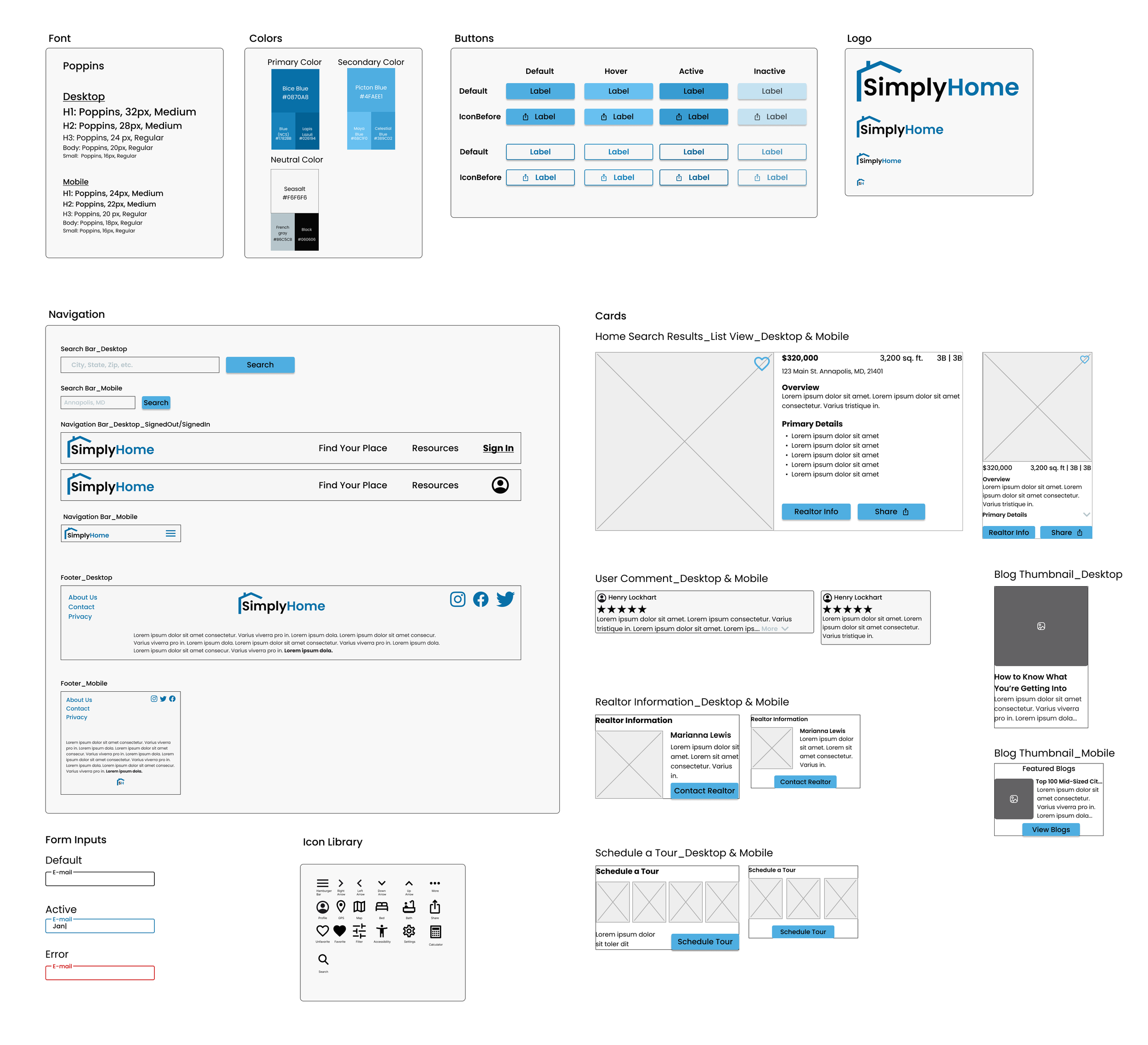
While drafting wireframes, I addressed the brand design and style guide for SimplyHome that would later be applied to the high-fidelity wireframes.
Test
Revisions
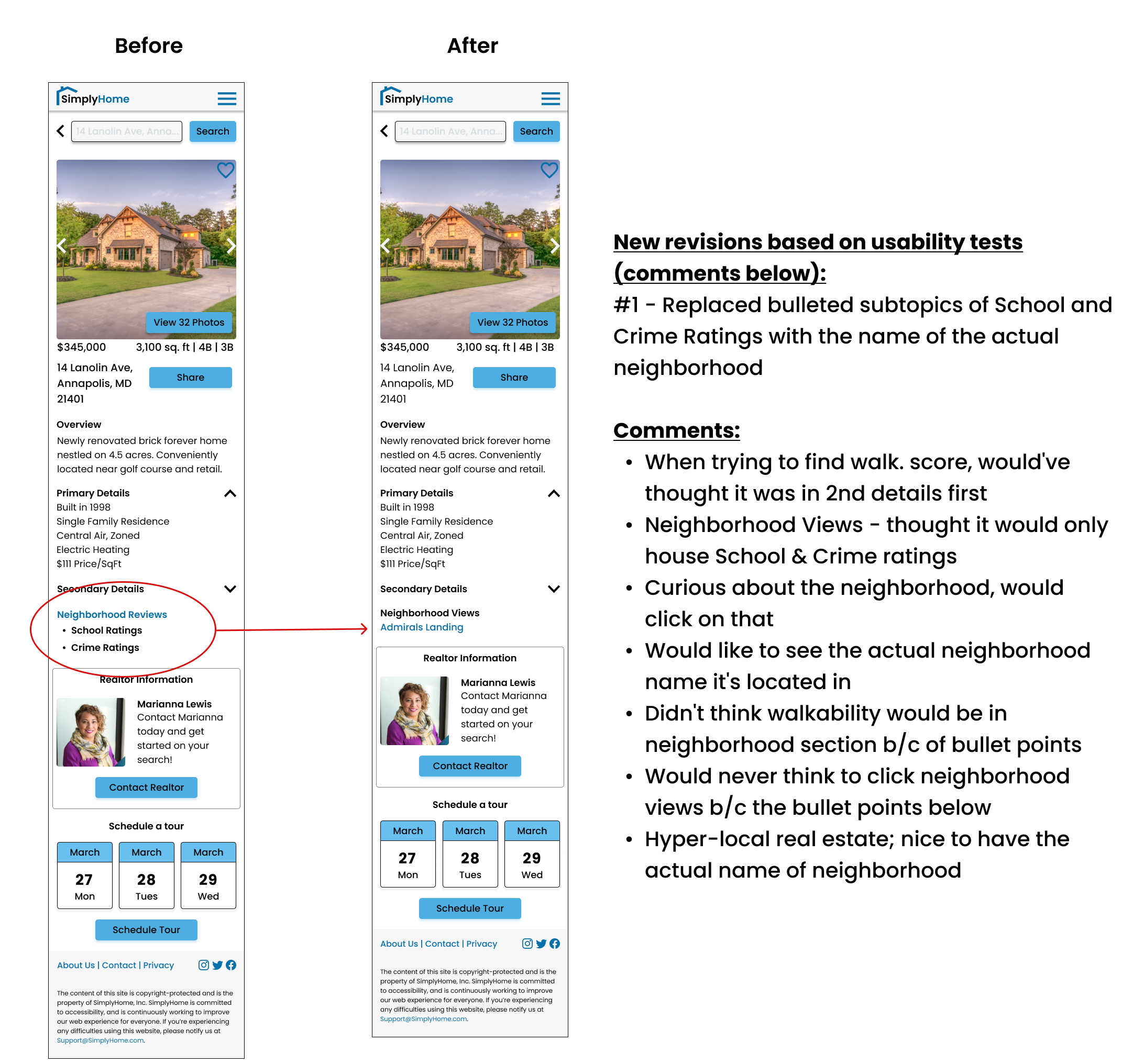
Using Figma, I created a prototype to test the two task flows based on the user needs uncovered earlier. Usability tests were conducted with 5 participants over Zoom. Using affinity mapping, I was able to identify patterns and insights from the users that would help inform future revisions for the final deliverable. After analyzing the results, the below findings were uncovered:
There was a 100% completion rate for both task flows tested.
The ‘Contacting a Realtor’ task flow worked well, with no major changes needed.
Users expressed slight confusion with the name of the ‘Neighborhood Reviews’ feature, as well as the subtopics.
Overall, users found it easy to maneuver, and that it had all the key elements you would expect to be able to navigate.
Outcomes and What I Learned
This was a very rewarding project as I was able to gain experience in each phase of the human-centered design thinking process and produce a minimum viable product as a result.
In retrospect, I would’ve liked to have interviewed more users to help reinforce my findings, but due to time constraints had to work with the research we had (which is better than nothing!). Overall, I’m proud with how the finished product turned out.


